
You can use
Excel to create graphs like this.
NB This tutorial was made in 2003. Google Sheets would be your go to now :-)
Step
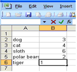
1 - Start Excel & then Insert your data into columns A &
B.
Make sure you leave row 1 blank.
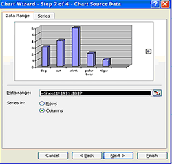
Step
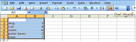
2 - Highlight all your data in both columns by left clicking
in the top right hand corner of cell A1 and dragging to the bottom
right hand corner.
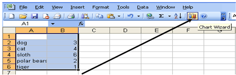
Step 3 - Press the Chart Wizard button to convert the data into a
graph.
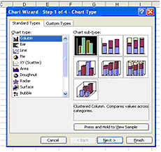
Step
4 - Choose a graph that WILL communicate the meaning of the
data effectively. (Not just pretty
pictures)
Step
5 - Press 'Next'
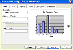
Step
6 - Write in the title of your graph and press 'Next'
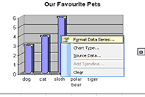
Step
7 - Right click on any column and choose 'Format Data Series'
then choose the colours of the graph.

Step
8 - Right click on the Wall, choose 'Format Walls' & select
a colour.
- You can also
format the floor of the graph by right clicking on the floor &
formatting it.